The 2018 Apple iPad Pro (11-Inch) Review: Doubling Down On Performance
by Brett Howse & Andrei Frumusanu on December 4, 2018 10:00 AM ESTAccessories
Apple has come out with a new lineup of accessories for the iPad Pro, which isn’t surprising with the design changes they’ve made on the new model. All of the major first-part accessories have gotten an update for the iPad update.
Apple Pencil
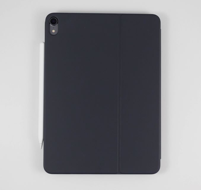
The Apple Pencil has gotten a nice update for the latest incarnation. Gone is the silly Lightning port and cap on the end of the old Pencil for charging and syncing. The new Pencil simply magnetically attaches to the right side of the iPad (when in portrait layout) where it wirelessly charges and syncs with the iPad. There’s no other way to say this other than the new method to add a Pencil to the iPad is about as perfect as it can get. There is no buttons to hold, settings to go into, or waiting. You just attach it, and the display will show a Pencil is attached, and then you can start using it.
The Pencil now has a single flat side to allow it to connect to the iPad securely, which is a great way to store it. But as with any magnetic connection, be careful that the Pencil doesn’t get knocked off in a bag and lost, because it isn’t inexpensive to replace, especially with its $30 price increase over the old model.
This single flat side also includes a capacitive button which can be mapped to various functions depending on the app in use, which would let you do things like quickly erase, or change the pointer size, just by tapping on the side of the accessory.
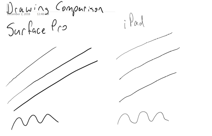
In use the new Apple Pencil works just like the old one, and that isn’t a bad thing. The latency is low, and the thin display stack keeps the refraction to a minimum. Apple’s Pencil continues to offer a great writing and drawing experience. Comparing it to the Surface Pro, the Pencil feels slightly better in the hand, and the capacitive button is easier to use than the physical button on the Surface Pro. However Microsoft does offer interchangeable tips on their stylus, including a softer tip which gives a better feeling that you are actually drawing on the device, rather than sliding over the display like the Pencil does.
The Smart Folio Cover
The other accessory for the iPad is the normal cover, the Smart Folio, which offers the same origami folding experience that customers have likely become accustomed to on the iPad. There isn’t much to say here, other than the cover only lets you stand the iPad up in landscape mode, although you can also use it to prop up the top end to use it like an easel for drawing, which is nice. Compared to the integrated kickstand in the Surface Pro though, the stand is wobbly and takes more time to get set up.
Smart Folio Keyboard
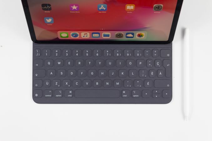
Apple has changed the design of their keyboard cover to remove some of the complexity, and the new Smart Folio Keyboard is a fairly straightforward design. You simply open the cover, slide the iPad forward a bit, and lock it into one of the two notches of the cover to provide the desired iPad angle. It is a big improvement over the outgoing one in terms of ease of use, although it is still not the easiest accessory to deploy. Offering two different angles is also a 100% improvement, although it is still somewhat limiting, and having the keyboard in the more vertical arrangement leads to a very wobbly tablet. The keys themselves haven’t changed much from the old version, offering very little travel, but they still offer a good typing experience. If you are someone who wants to type a lot on the iPad Pro though, the smaller model is somewhat cramped.
Much like the Apple Pencil, the keyboard has also increased in price, up to $179. At this price, it still doesn’t offer any backlighting either, which is unfortunate since the competition does. If you opt for the larger iPad Pro, the 12.9-inch keyboard is $199. It seems like a high price to pay for a keyboard which is, at best, average.
iOS keyboard integration still leaves something to be desired as well. There are still very few keyboard shortcuts, and with no pointer support, you will find yourself reaching up to the screen quite often. Even things that have been sorted out years ago on the PC side are a new frustration on the iPad, such as opening a new tab in Safari. If you do open a new tab, the address field is not pre-selected, so you then have to tap into it to begin typing. This isn’t the case if you open a new tab with the keyboard shortcut, at least, but other apps like the App Store function similarly, where if you hit Search at the bottom, the search field then has to be tapped to actually type. The keyboard does give you the option to type with proper feedback, unlike the on-screen version, but it really does feel like an add-on to iOS still.
This entire section was written on the iPad using the Smart Folio Keyboard, and with the auto-correct functionality in iOS and Word, it worked quite well. It isn’t as easy to use for pounding out documents as a PC would be though, although you can always connect a real keyboard if needed over Bluetooth, or even USB.


145 Comments
View All Comments
jeremyshaw - Tuesday, December 4, 2018 - link
Crikey, that's a fast chip.That question about the xbox one s class GPU does raise questions. Why does the Xbox One S draw so much power?
axfelix - Tuesday, December 4, 2018 - link
Because it's still using an AMD GPU architecture from 2013, and Apple's and Nvidia's architectures are >3x as powerful per watt at this point.PeachNCream - Tuesday, December 4, 2018 - link
Eh, NV is just as bad. Their current gen products (GT 1030 aside) generally need more than 75W of power and occupy space equal to two PCI-E slots.Pyrate2142 - Tuesday, December 4, 2018 - link
Yeah, but those 75W and above cards are operating at a significantly higher performance. You cannot really compare it straight like rust, because 1- not only is the NV cards doing full FP32 compute compared to mixed FP16 and FP32 on the iPad, meaning it is inherently a more strenuous workload to begin with. 2- performance scaling is not a linear functionIn short we can't really take those claims at face value because A- we don't have a way to measure and compare performance in the first place (which brings me to the question of how is apple actually comparing? Using TFLOP performance? Because TFLOP is not an accurate way of measuring GPU performance as a GPU has to do more than just FLOP. Take a RX580 at almost 7 TFLOP and a similar GTX1060 6GB at 4.5TFLOP in FP32. The TFLOP difference suggests a huge performance differences butcher they both perform similarly.) and B- again NV doesn't really make cards that scale down to what the iPad is having. In short, best case it's truly an apples to oranges comparison and I don't think you can directly translate that GPU in the A12X performance against AND or NV because it just not the same comparison both in power target of even how the performance is measured
Spunjji - Wednesday, December 5, 2018 - link
Just responding firstly to endorse your comment, and secondly to note that Nvidia do make something at that scale - the 256 CUDA-core Pascal GPU in Tegra X2 would be a solid point of comparison, were it not basically impossible to perform one.olde94 - Wednesday, December 5, 2018 - link
For power/performance i have a few inputs.When looking at Nvidia jetsons running X2 and X1 most performance improvement are on the CPU side of things.
Also for power refference. The Nvidia shield is not a portable device, and the nintendo switch, running the older version of the 256 cuda core SoC have the GPU running at 764mhz in docked mode and 324 in handheld. The reason is a combination of the battery and the active 30mm fan + somewhat heatsink, cooling solution. The charger is 40W charger, and while it does charge the battery, i will assure you no more than 15W is used for this, and based on charging time during full load, it's less than 10W. Note also that the screen is NOT on.
An nvidia TX2 is rated at ~20W if i recall, making it WAY more power hungy than the A12 chip
PeachNCream - Thursday, December 6, 2018 - link
Eh, the A12X puts a lot into perspective when it comes to compute performance. The big three players in the x86 CPU and GPU space are chasing performance at a cost of rising TDP, at least the phone and tablet competition is highly constrained by power and thermal limits inherent to the platform. The result is that the technological improvements we see in those highly mobile products generally focus on both power and performance. Its a pity to see stupid dual slot coolers on graphics cards to that have to cope with TDPs that range from 75 to an absolutely irrational 200+ watts and processors that blow their TDP budget by 50% under load. I had a Packard Bell 386 PC that was happy with a 60W internal power supply. Computers in 2018 are stupid. They shouldn't even need cooling fans at this point or heatsinks. That old Packard Bell ran a bare IC without even so much as a piece of metal glued atop it and under load, you could rest your thumb on the CPU and it would feel warm, but not hot to the touch.Oliseo - Thursday, January 2, 2020 - link
That old packard bell was orders of magnitude slower than modern CPU/GPU's and was orders of magnitude less effecient than modern CPU/GPU's.Even if you normalised for cooling requirements.
This doesn't make modern CPU's/GPU's stupid, you know what it does make stupid tho....
tipoo - Tuesday, December 4, 2018 - link
It's several fabrication node shrinks back (28nm vs 7nm) and on a 2013 architecture.You could probably get something close-ish to XBO performance in a handheld Xbox on 7nm, that would be an interesting product if it had full compatibility...
axfelix - Tuesday, December 4, 2018 - link
The Xbox One S (which I think is the comparison here) is actually on 16nm, though it's still that 2013 architecture. I think Apple gets about 2/3 of the advantage from the architecture and 1/3 from the process, and it does work out still to >3x efficiency.