Motorola Atrix HD Review: Fast, Sharp, Bargain
by Jason Inofuentes on September 5, 2012 12:00 AM EST- Posted in
- Smartphones
- Motorola
- Mobile
- Atrix HD
Software
If you’ve been following our Motorola coverage for a few years, you’ll recall that Motorola’s first skinning initiative, Blur, wasn’t well loved. In an effort to put some distance between itself and its progeny, Motorola stripped its skin of any naming convention whatsoever. Initially, there wasn’t much difference between Blur and not-Blur. We’ve come a long way, though. Today’s Motorola skin still has its decorative flourishes including replacing all of the stock icons with more colorful ones, even in Settings. The stock wallpapers are brightly colored, with plenty of blues and yellows, which pop thanks to the inaccurate color representation. But much of the aesthetics of stock Android remain intact, from the Notification Shade to the People app. There’s even on-screen Home/Back/App Switcher buttons. So, it’s stock plus.
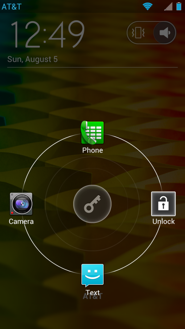
And what’s the plus? Let’s start with the lock screen. The action area is centered instead of left justified, and on contact a ring with four icons is revealed: Phone, Unlock, Text and Camera (clockwise from the top). The apps aren’t user configurable but are an inoffensive selection. One user configurable spot could have really sealed it for me, since I’m far more likely to only want to go Twitter quickly than Messaging.
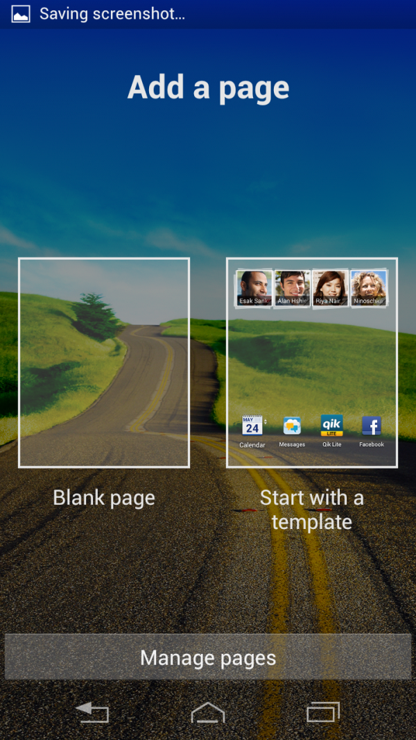
You’ll recall from the preview that home screens aren’t populated in the usual Android fashion. Usually the primary home screen is in the middle of a pack of five or seven. Here, the primary home screen is at the far left, and while up to seven can be used, there’s only one populated initially. A swipe to the left from the last available page brings up a menu to add a Blank Page or one from a template. The templates mirror the usual assortment you find, one with a social networking widget, one with a favorite contacts widget, one with all the carrier branded apps, and so on. Having them be optional is a surprising breath of fresh air; imagine, not having to start off by removing dozens of widgets and icons that are half-baked and will hardly get used.
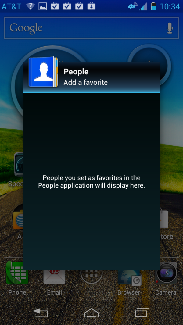
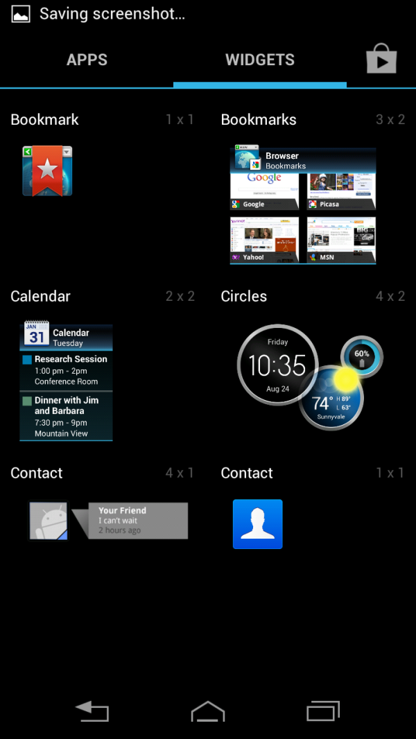
There’s more, though. A key part of the half-baked widgets I mentioned is that they took up valuable real estate. A contacts widget that featured my four most frequently used contacts is great and all, but that 4x1 widget takes the place of four apps I could have on my home screen. Motorola solved that issue by hiding the widget in the app’s icon, and I couldn’t be happier with this. Some of our readers have already trumpeted their favorite app that implements this functionality in the comments of our preview. We don’t deprecate the contributions of the developer community to Android UI and functionality, but for an OEM to adopt something useful is always a treat we like to highlight. Highlighting these efforts are our way of reminding them that good software really, really hits our sweet spot.
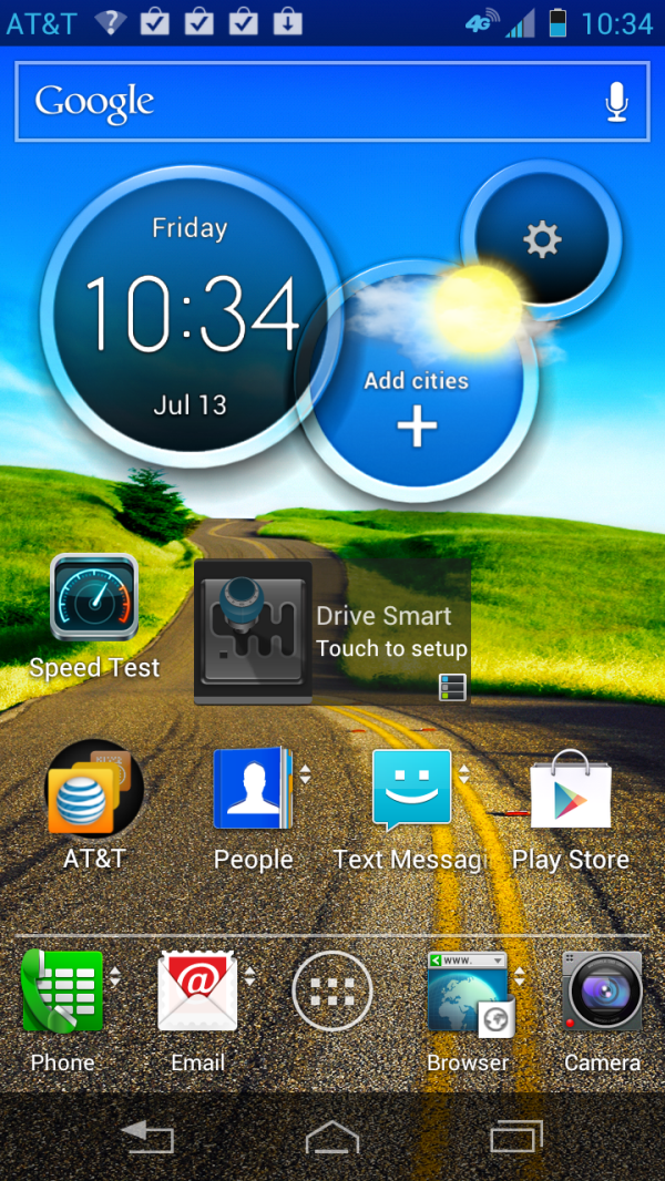
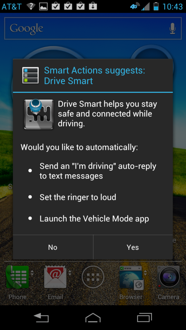
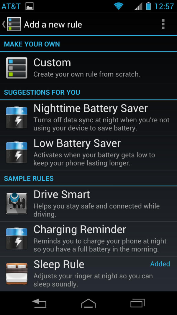
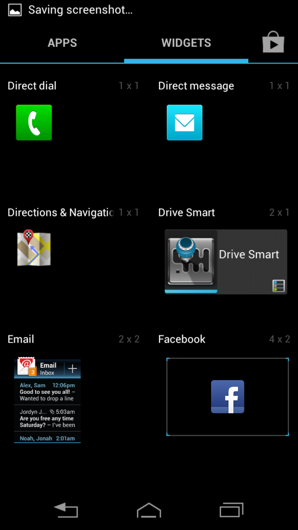
Smart Actions makes its return after it premiered in the Droid RAZR. The updates have included new scenarios to trigger, including the Drive Smart app, a simplified driver focused UI. A 2x1 widget on the home screen allows you to configure triggers for Drive Smart based on being inserted into a car mount or connected to a particular Bluetooth device. We liked Smart Actions before, and the simplification of scripting events is still quite nice now. As geolocation becomes less and less costly to battery life, we can expect to see geofencing be a more ubiquitous tool for controlling our phones. To get the most out of a feature like this, though, you have to take the time to configure it. Motorola tries to make this easier by offering suggested Smart Actions, periodically; this seems to be a scripted event in and of itself, with generic suggestions popping up every few days.
And then there’s the ubiquitous clock/weather widget. I’m not a fan of widgets, but I do like a good weather widget. Even when I run a stock ROM I generally add the News & Weather widget to my home screen, simplistic though it may be. Motorola’s Circles widget is a bit more than that. Three semi-transparent circles stretch across a 4x2 widget, the largest is a clock, the middle one shows the weather and the smallest shows either battery information or data usage, along with a settings menu. Flicking up on a circle (the same motion that brings up the widgets corresponding to stock apps) changes its state: analogue/digital for the clock, data/battery for the information circle and amongst the list of added cities for the weather app. This little guy is a fantastic use of space, while also adding just the right amount of flourish without being showy.
I don’t like being glowing, but unlike so many other skins, I can’t find anyway in which Motorola’s skin offends. It’s stock plus. And I like it.
But . . . something's missing. The Atrix 4G introduced a paradigm that excited us all, leveraging the computing power of a cell phone in a netbook chassis. The Linux instance that drove the WebTop UI was limited in scope, and in satisfaction, not in small part by the performance of the Tegra 2 chipset that drove it. In the Atrix 2, the TI OMAP 4 performed admirably relative to the Tegra 2, but it still wasn't enough to make me wnat to use it. So, WebTop is gone in the Atrix HD. The placement of the microUSB and microHDMI ports matches several recent devices, so it could physically be compatible with the LapDock variations. But inserting it would just yield display mirroring, with no other benefit aside from being able to use the keyboard and trackpad. Then again, the Asus Transformer has shown that Ice Cream Sandwich can be used comfortably in a netbook chassis, so perhaps Motorola felt that was enough. Either way, RIP WebTop.
Camera
When it comes to camera, Motorola hasn't been the king of the hill. Samsung and Apple pushed things pretty far, and HTC made their play with the ImageSense branding that tied an impressive ISP, optics and sensor package together. And then there's Nokia's PureView 808, which is more a camera than a modern smartphone. Motorola hasn't planted their flag in the same way the others have, but they also haven't slacked off. The interface is a lot like other aspects of the phone's software, close enough to stock that you might not notice a difference. Unfortunately, part way through the review the rear-facing camera gave up the ghost. I'm not sure what caused the loss, and a full reset wasn't enough to fix the problem. This played into the delay in this review, and I received a fully functioning sample today and put it through its paces.


Atrix HD Camera (left) and Galaxy S3 (right)
Quality is good, the Atrix HD is most likely leveraging the Qualcomm ISP, but using the RAZR's optics (4P F/2.4) and sensor (possibly the OV8820), though now configured with a focal length of 4.36 mm. Well lit images are quite good, though colors can be a bit oversaturated at times. Turn down the lights though, and things go from good to bad, quick. Noise pervades any dark areas in a shot, and pictures taken in darkness come out relatively bright, but very noisy. Comparison shots with the Samsung Galaxy S 3 (here wearing VZW branding, but running CyanogenMod 10) show how much less aggressive the SGS3 is with its ISO. So, while the shots aren't terribly noisy, they are darker than the Motorola equivalents. In partially lit scenes, though, the SGS3 does a much better job.
Video quality is good, with files recorded at 1920x1080 with a bit rate around 16 Mbps. The interface includes several audio options that leverage the multiple microphones for better scenario based sound recording. In Stereo mode, the amount of separation is impressive, and the noise canceling does a reasonable job; the other modes seem to be variations on this with emphasis on specific types of noise canceling. It was harder to discern how well these worked, relative to other modes or solutions, but it's always nice to see OEMs make an effort.




47 Comments
View All Comments
Schadenfreude - Wednesday, September 5, 2012 - link
I hate to be "that guy" - but the correct first sentence/question "is there room for . . ." instead of "their".There, I said it!
JasonInofuentes - Wednesday, September 5, 2012 - link
Thanks, it's fixed now. Their's always one. :)noblemo - Friday, September 7, 2012 - link
Similarly, I think "tack" should be, "tact."noblemo - Friday, September 7, 2012 - link
Well, "tactic," actually.coolhardware - Wednesday, September 5, 2012 - link
Thanks for mentioning the Atrix HD's color balance issue!I too have a Motorola phone with a 'nice' display, the Motorola Photon. The display looks 'nice' when you look at the spec sheet, but when you actually look at the screen it is way skewed toward blue.
However, there is a software solution that has worked well for me:
http://www.jdhodges.com/2012/07/correcting-color-b...
and after making the adjustments using the Android color filter app the screen looks MUCH better!
I hope this helps anyone else in a similar situation and I would love to see how the Atrix HD subjectively fared after being adjusted using software. :-)
jjj - Wednesday, September 5, 2012 - link
Interesting device,now lets see what they have to show today,hope it's something relevant (if anyone cares Moto is live streaming the event on their youtube chan)dagamer34 - Wednesday, September 5, 2012 - link
If 8GB worth of NAND Flash clearly isn't worth the $100 difference between this one and the Galaxy S III or the HTC One X when it debuted, one has to wonder why the GS III and certainly the iPhone 4S sell for so much in the first place.Oh well, no more iPhones for me. I'm tired of basically being cheated on the cost of Flash.
Death666Angel - Wednesday, September 5, 2012 - link
SGS3 is lighter, has a bigger, removable battery, SAMOLED display (which is superior to normal LCDs in my book), double the RAM and double the NAND. That's what that extra $100 gets you. I'd chose the SGS3 over this any time.zero2dash - Wednesday, September 5, 2012 - link
I strongly considered the Atrix HD because I didn't want to pay $200 for a SGS3 and I hoped that the Atrix would be "good enough" for half the price. In the end I figured I might as well buy something that meets or exceeds my needs now, and should hold up in the future.....and I went ahead and paid the extra $100 for the SGS3. Couldn't be happier.The general consensus seems to be to not compare the AHD to the SGS3 or the One X and I think that's a good point to make, because the AHD is, as the review states, more of a middle class device than a higher class/top tier phone. With One X's now being lowered to $99, I think the AHD is an even harder sell than it already was and I expect these to drop to $49 before too long otherwise they're going to have an even worse uphill battle. Clearly the price tag of the SGS3 is not scaring people off.....and for good reason - it's a phenomenal phone, arguably the best phone available today.
Impulses - Wednesday, September 5, 2012 - link
The AHD is already $50 at several third party retailers... Probably free during holiday sales, quite a lot of phone for very little (contact renewal and that whole ridiculousness aside).